A Designsystem for a rising Start-up in the field of education
Why?
Aim is to connect the german school landscape with the business world and offer education for everyone interested in agile, digital learning
The product
An iterative design thinking process
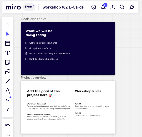
Workshop
This project starts with an „Empathise“-Workshop to gather all information available and dive deep into understanding and talking about the background and motivation of Rise Up. The team works with emotion cards and groups them in various order of tasks. Aim is to end up with three to four cards representing most of Rise Up.
Insights
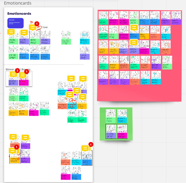
the team formed 5 groups to sort the emotion cards into fields of interest in Rise Up
the groups focus on representation purpose on rise up aims. Customer or Businesspartner are not considered yet
the team led proactive discussions about their choices of 4 cards and convinced the rest of the team
each card is in need of an clear definition of the teams understanding (word-descriptions noted)
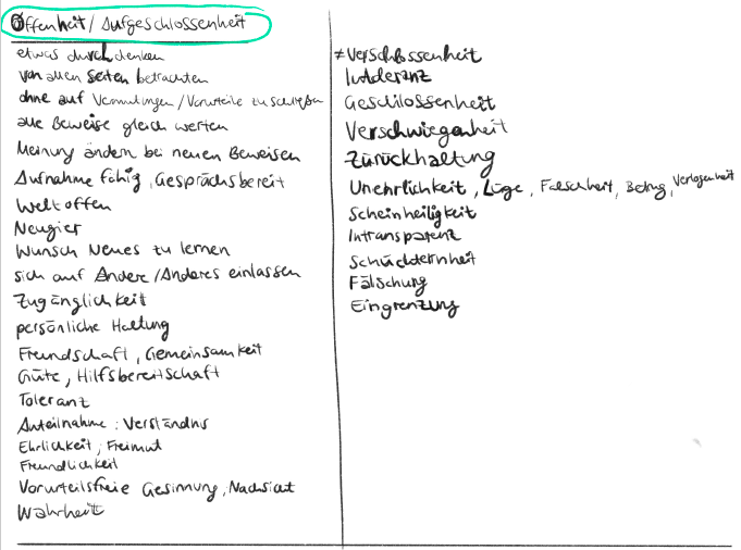
Wording/ Scribble
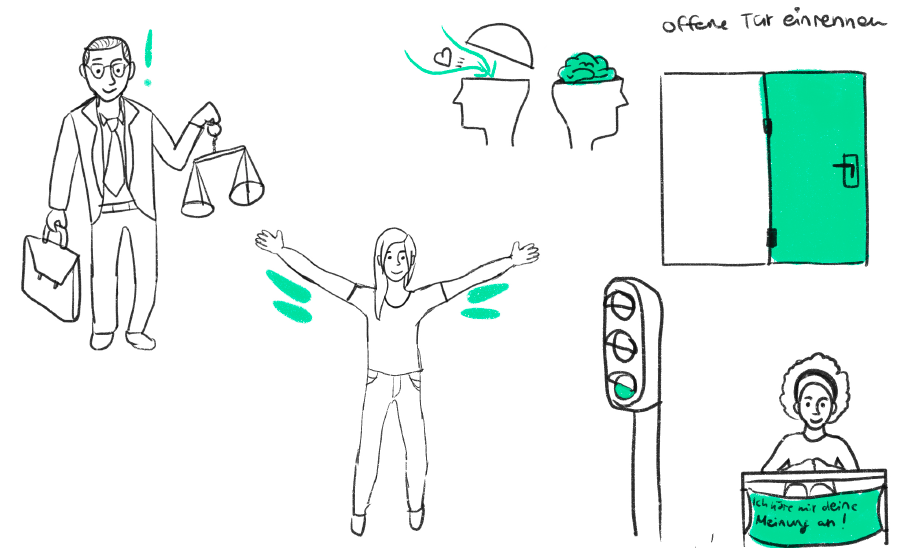
After the field and the background of Rise Up got illuminated in the workshop the next step is to define the findings. Each of the four emotioncards needs a foolproof checklist to finalise its meaning and the usage of it. Together with the written definition (photo on top: left are synonyms and on the right are antonyms) are scribbles visualising the meaning.
Insights
while collecting synonyms a new level of understanding opened up and connected it with the emotion-memory
antonyms will be used later on to deliver a verified NO-List for checking content for it. When it meets the words the content will be outsourced
sketches can describe words only partly
while drawing a color came up supporting the meaning
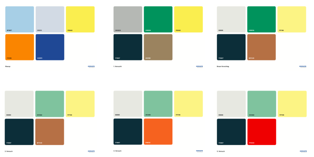
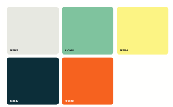
Define colors
This step contained various meetings with the design team. The basic colours were already set before. Focus now to define the palette – with its shades.
Insights
connecting color to importance of emotion for company aims
two of four most relevant emotions received clearer color shades to stand out
the other two got brighter shade
possible future usage of Colors assumed
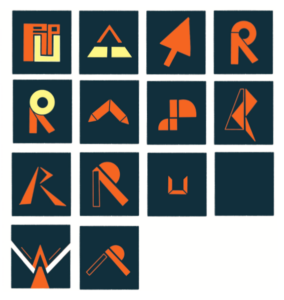
Scribbles Logo
This step contained various meetings with the design team. The basic colours were already set before. Focus now to define the palette – with its shades.
Insights
connecting color to importance of emotion for company aims
two of four most relevant emotions received clearer color shades to stand out